CHRISTIES
2017
Principal Product Designer
Freelance
Product Design
Responsive Web
Editorial
Christie's – the historic auction house serves as both a marketplace and an influencer in the art and design world. In 2017, the brand was at a pivotal juncture in its journey to modernize and adapt to the digital age.
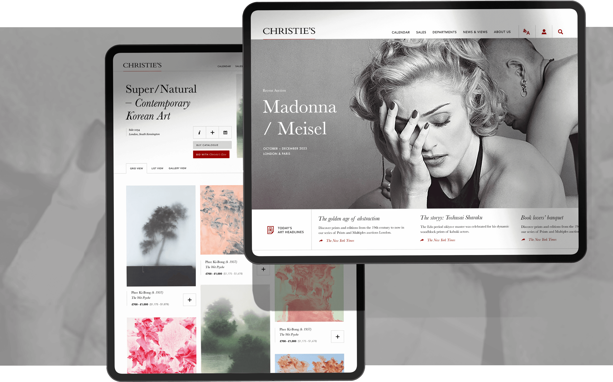
As Christie’s invested in its digital products, I joined a new product function to create a revised product vision across their web experience.
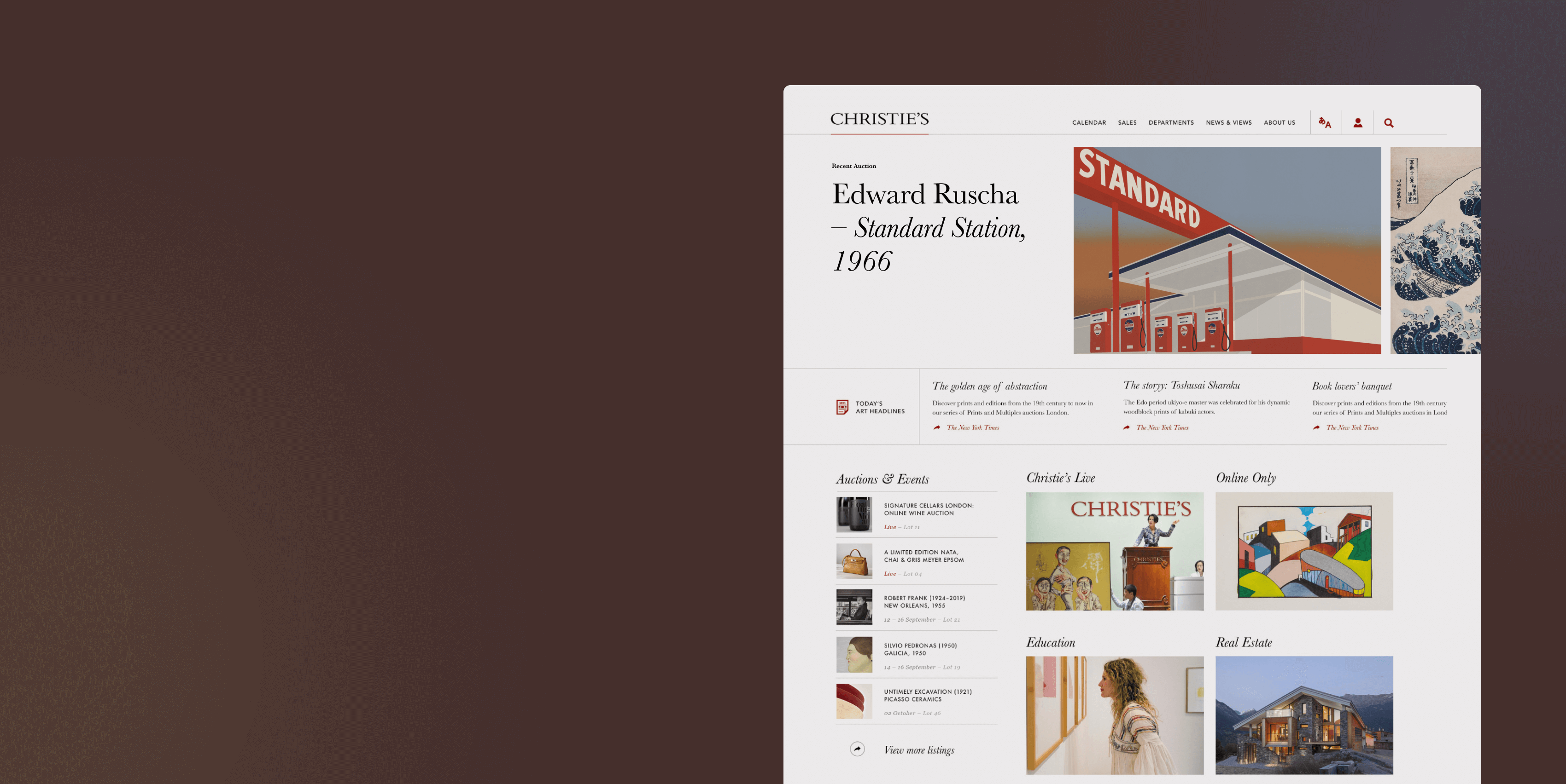
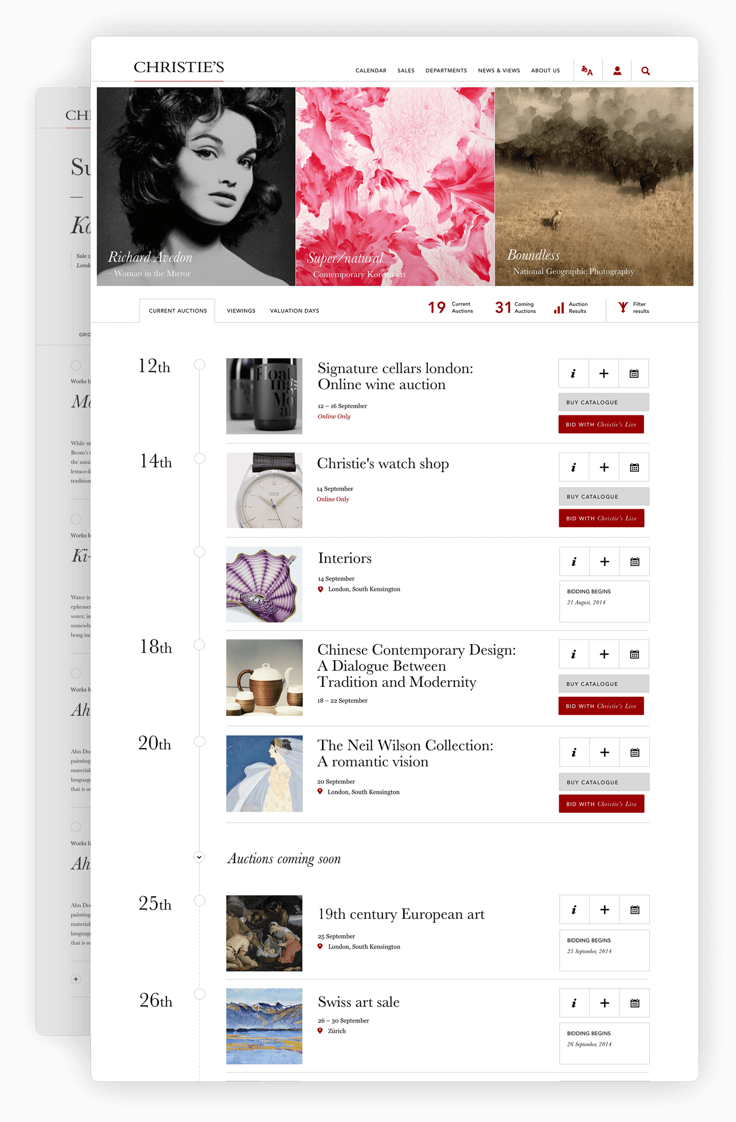
Key focus areas included overhauls to the online content areas and its ability to integrate with auction and ecommerce areas, a global auction calendar and a creation of flexible shopping modules. The aim was to seamlessly integrate the brand with modern design aesthetic and technology, ensuring that both frequent and first-time users could navigate Christie's vast range of content with ease.
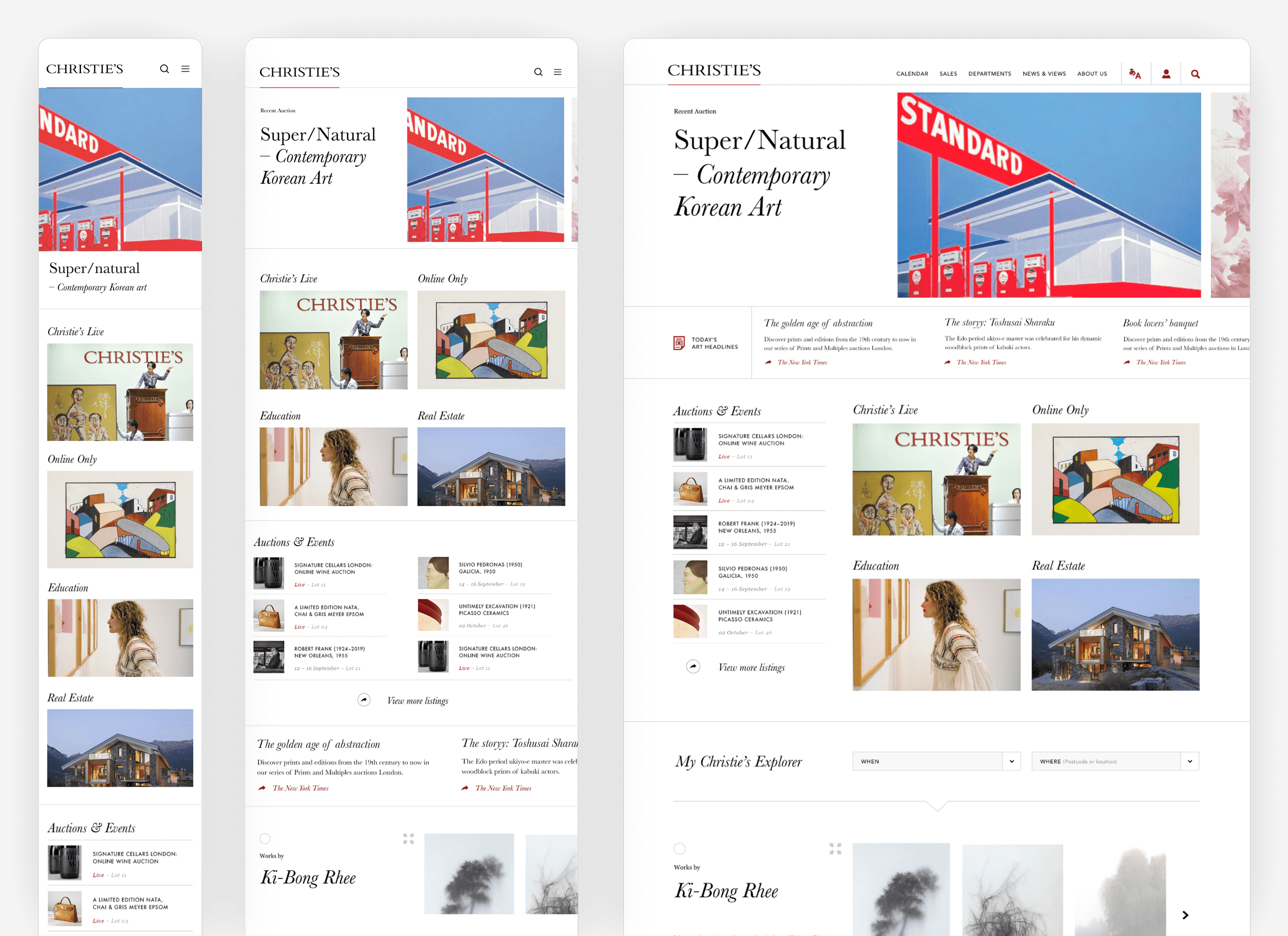
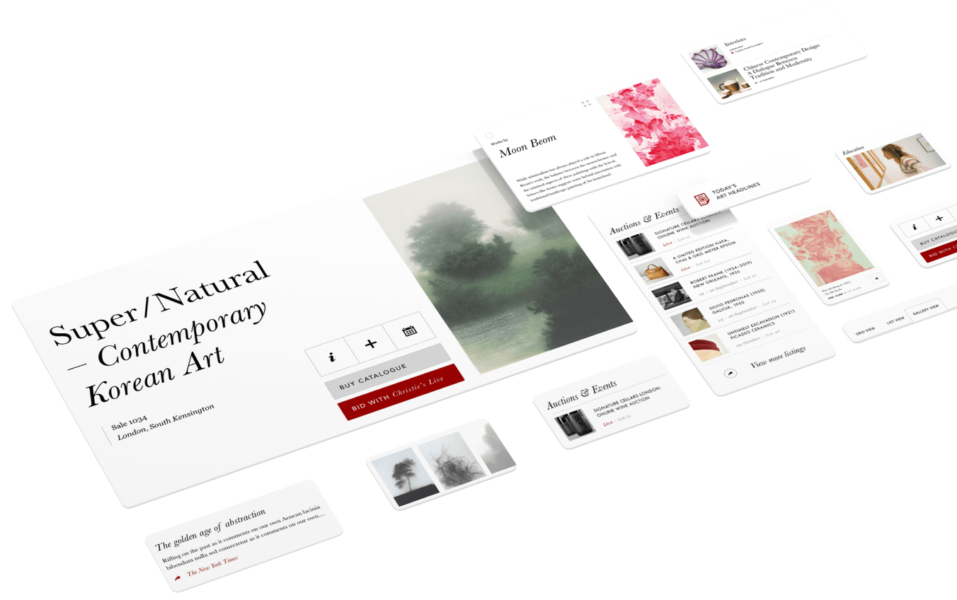
The modularity of all newly delivered UI was key for consistency, flexibility and maintainability, as well as binding together disperate product experiences
All components were proofed across different content areas. By using a consistent grid system across all pages and modular component containers, the UI can be composed rapidly.
Homepage Slider
Using artwork as content has its limitations, like being unable to crop the imager resulting in many different image ratios. This homepage slider horizontally 'stacks' images which are sized to fit vertically. The animation is designed to remove jarring experiences as the slides transition to accommodate a new image ratio.
Auction Calender
One of the more complex components within the delivery. The Auciton calendar has many different functions depending on the item type, each with specific user tasks/options. To map these, I focused heavily on the IA structure before jumping into the creative.
Auction Browser
An auction can feature multiple works from multiple artists. A slightly refactored slider module was designed with the same sizing constraints as the Homepage Slider, but optimised to work as a row in-page. To add to the immersion, a full-screen isolation view was designed to showcase each art piece.
Article Interactions
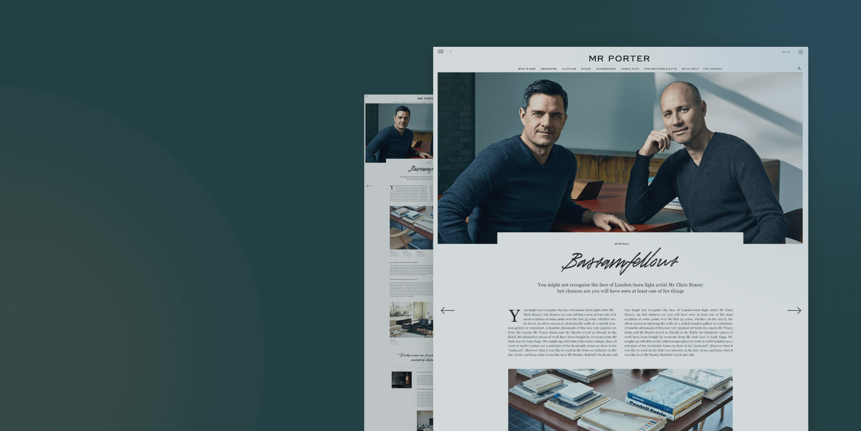
Despite long-form written articles, the editorial portion of the site includes live auction art modules, supporting imagery and the ability to house auction modules from previous areas of the site. Sticky UI elements, such as navigation arrows and read-time display help support the user while scrolling potentially long pages.
